We don´t see the world as it is, we see it as we are
The Gestalt school of Psychology rises to the awareness of how we perceive and interpret the world. Beyond our senses, it is our mind which builds the models of what we make out of the world. Some go as far as to say that reality is a simulation, or that we hallucinate our reality.
As a matter of fact, it´s more about how we understand what we see than what we are actually seeing. Our minds abhor emptiness and void significance. We need to make sense of things by conveying meaning as if with such constructed interpretation we could understand reality. This has actually worked in an evolutionary sense, by simplifying, averaging, and assigning meaning as a form of visual itemization process of the things we see, allowing us to correlate those itemized images in order to understand our surroundings.
Gestalt theorists have classified several principles based on this phenomena. As designers, understanding such principles will help us to create more effective and maybe original ways to visually convey our ideas.
In order to explain and inspire, I will try to exemplify some organic and natural examples occurring in non-designed, natural environments first, and then will go on to review some great design and art samples in which some of these principles are applied, hoping, in selected cases, to go as deep as to make sense of the intention of designers and artists.
I will not cover each and every principle right away. Instead, I will go on building a series of deliveries in which we can entertain ourselves with a certain depth. In this delivery, we will cover Similarity, Anomaly, Symmetry, Figure and Ground, Closure and Proximity.
My intention here is to let you understand the principle from its psychological and significant perspective, as to allow you to understand our processes of perception, suggesting you a way in which to use these principles as powerful tools of design and communication.
Similarity in the Natural World.
Similar things belong together. Flocks, groups and the such always tell us about strength and unity. Uniformity makes the many, one.
Similarity in the human world.
One of the most dramatic uses of the similarity principle was made by architect Albert Speer´s organization of the Nazi rallies prior to WWII. The whole intention was not only to denote the martial spirit of Nazi Germany, but to convey a strong message of monolithic and overwhelming unity as a propaganda message to the world and to the population. He will not only use one, but three flags, then use evenly spaced large repeating vertical banners and clean cut uniforms. Martial use of uniformity is not only used to differentiate armies, in these contexts is used to enhance the cohesion of the collective over the individual, besides becoming the most direct intimidation message to the enemy.
Breaking Similarity: Anomaly.
If similarity conveys unity and the predominance of the collective over the individual, anomaly achieves exactly the opposite: here the pattern is broken in order to enhance individuality, being out of hierarchy, being on originality, or in just being different and outstanding in a world where everything is standardized, the same.
In the epic Braveheart battle sequence, the blue painted face of William Wallace stands out of the crowd. In an orchestra, the director is usually the only one standing. In Da Vinci´s Last Supper the central figure of Jesus stands out in a harmonic, central pose against the most chaotic poses of the disciples. The coach of the football team stands out precisely by being the only one not to use a uniform. Being the only one not to do the Nazi salute in a rally, is a very strong statement of defiance.
Figure and Ground, which is which?
We could say that M.C. Escher was one of the masters of this resource. The figure and ground phenomena can be stated as the symmetry of opposite visual meanings. Empty can be full, and full, empty, and each can have equally contrasting content. Angels vs. Demons in Escher, Ladies and Gentlemen in Fukuda´s poster, Victim and Aggressor and the Feminine and Masculine, as most of Malika Favre´s illustration, conveys.
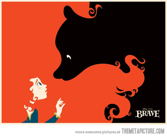
One content can be used to justify and complement the other, as in the empty space of slippers creating the Coca-Cola bottle profile, or two female hips in bikini forming a suggestive curve of the brand, or in the Brave poster, where the conflicting figures of mother and daughter come together intertwined in the extraordinary red hair of the girl.
Figure and Ground don’t need to be in conflict of significances; in the Hope for African Children logo, figure and ground are used to unify two concepts into one. Either to add or to confront, the potential created by the duality of this principle creates a lot of space for visual communication.
Symmetry.
While figure and ground is the symmetry of opposite meanings, geometrical symmetry is associated with stability, beauty, health and cyclic dynamism. Symmetries can be linear or radial; the Yamaha Symbol, composed of three tune forks in triangular, radial symmetry speaks about musical harmony. The Taj Mahal is a mausoleum dedicated to serene, eternal love. Flowers, leaves and symmetry in the human face talk about good health and beauty. The Swastika and the Recycle symbols give the idea of continuous and rotating, steady motion. Mandalas and Arabic concentric patterns carry us to the eternal and centred and serene view of consciousness and the spirit.
Closure, the suggestive work of Malika Favré, the subtlety of leaving it to the imagination.
Sometimes what you don´s see is more suggestive than what´s evident. The work of Malika Favré is full of the sensuality of the unseen. She forces the mind to build what it needs to see, accentuating the anxiety of desire.
Proximity: Unity through closeness
Many independent pieces become part of the new. Out of diversity, unity; this can be used to create a constructed symbol made out of variety, such as in the Unilever logo, to create object out of intrinsic value, as in the case of the basket made of Coke bottles, to create a shape brought together, both by closeness and closure, and suggesting technology, as in the scanline version of Paul Rand´s logo for IBM, or to convey the all-star level of the contest suggested in the UEFA Champions League logo. The significance possibilities of using an array of elements to create a whole make of this principle a very potent resource.
It´s no wonder that our primitive selves saw a world full of spirits and beings made of the same nature that surrounded us. We tend to see the world not as it is, but rather, as we are. After all, we see with our minds.


Leave a Reply
Your email is safe with us.